Believe it or not, gantt charts can be created relatively painlessly in MS Excel. A simple one will take about 15 minutes with only a basic knowledge of Excel, and I’m going to show you how.
Step 1: Enter the Task data
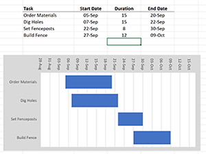
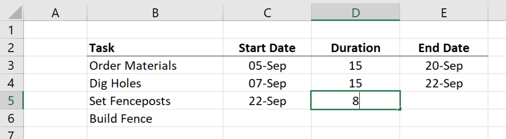
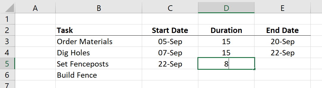
The first step is to enter your tasks in table form in Excel. Make sure you have the following four columns
- Task
- Start Date
- Duration
- End Date
Although the third column can be calculated from the first two, all three need to be present. Enter the data like this:
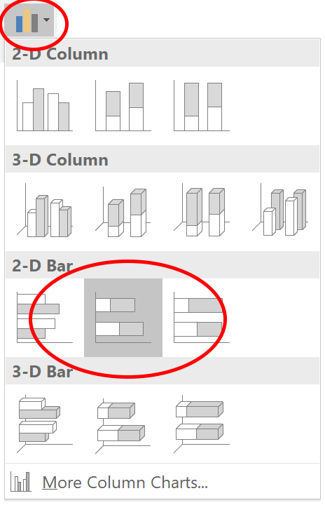
 Step 2: Create the Bar Chart
From the menu, choose Insert > Column or Bar Chart > 2D Bar > Stacked Bar. The icons look like this:
![]()
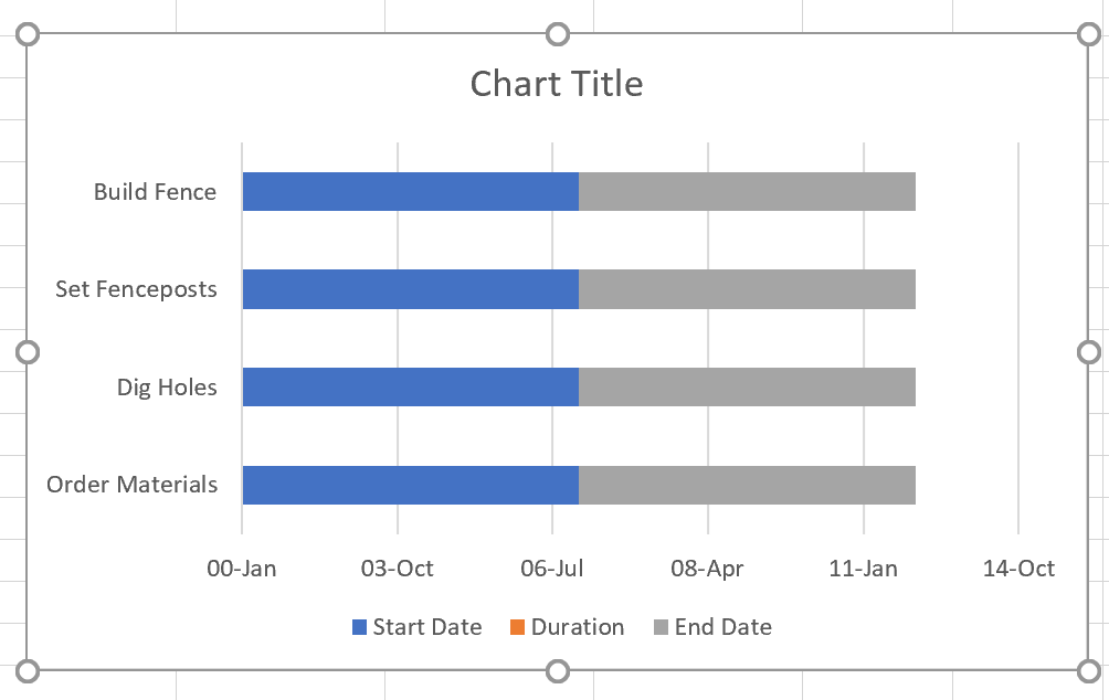
 The chart that is produced will look like this:
 Step 3: Adjust the x-axis
You cannot see the duration bars in between the blue and grey bars because they are extremely small. The size of the X axis goes all the way from January 1, 1900 until today!
Unfortunately, MS Excel uses numbered dates which go sequentially and start at zero on January 1, 1900. This makes fixing the X axis a little bit more difficult, but here’s the procedure.
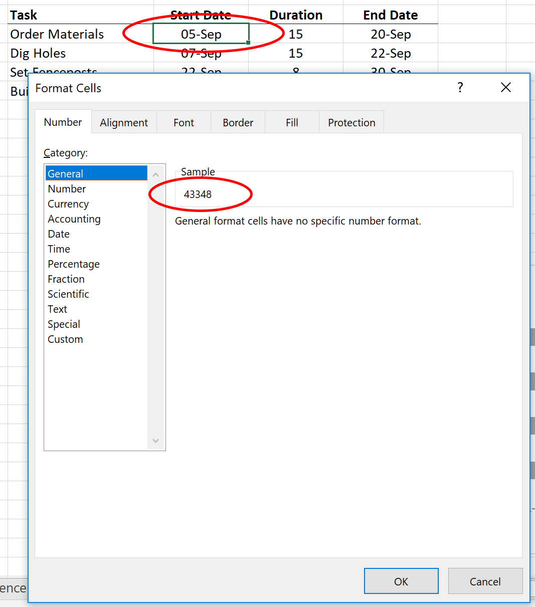
Select the earliest date in the spreadsheet, right-click, and choose Format Cells. Under Number > General, you will see the numerical number for that date. Remember that number.
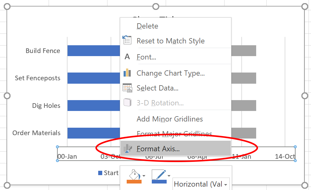
Back at the bar chart, right click on the X axis, and choose Format Axis…
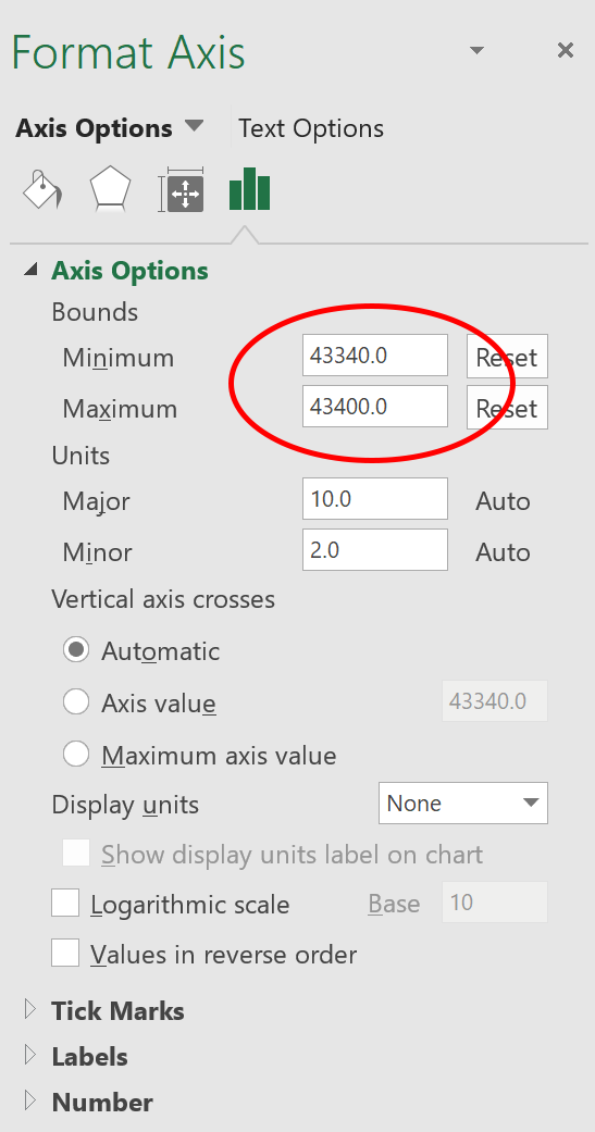
Enter the number you found into the Minimum box, and play with the Minimum and Maximum until you find the right range. Remember, one number equals one day.
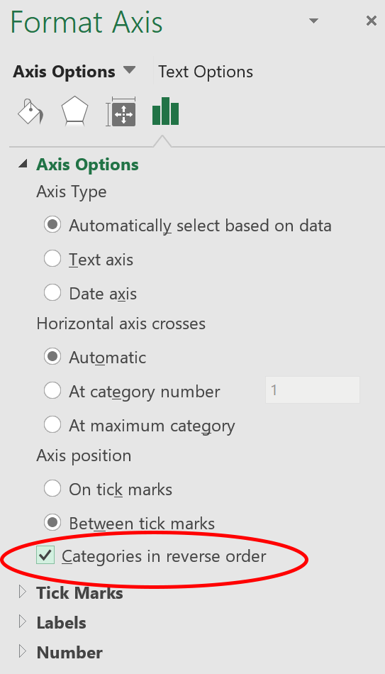
Step 4: Reverse the Order of the Tasks
As you can see, the tasks are in the reverse order. To rectify this, right click on the vertical axis and choose Format Axis…

Choose Categories in Reverse Order.
 Step 5: Remove extra bars
To remove the blue and grey bars on either side of the duration bars, right click on the blue and grey bars and choose Format Data Series…
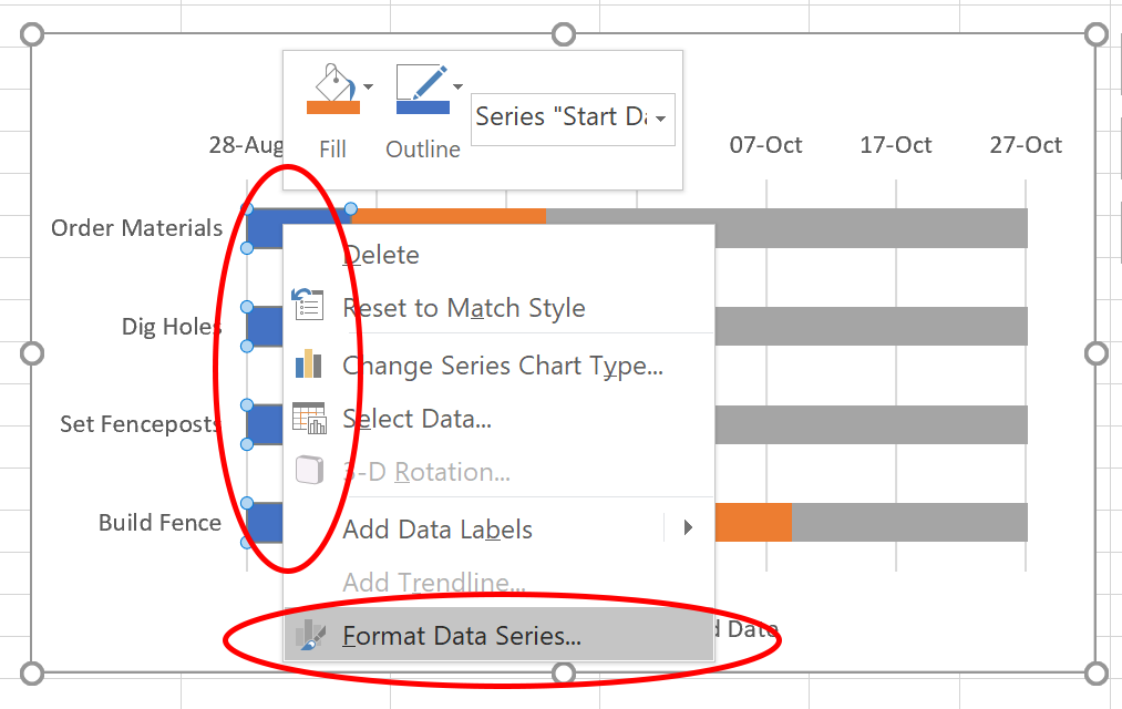 Choose No fill and No line.
 Step 6: Delete the chart title and legend
Highlight the Chart Title and legend and hit the Delete key![]()

Step 7: Miscellaneous Formatting
In my example, I used the following formatting, but you may wish to adjust this to your preferences:
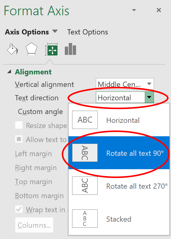
- The x-axis has its text rotated 90 degrees. Right click on the X axis and choose Format Axis… to get the following dialog box:
- The main chart area has a grey background. Right click in the chart area outside of the graph, and choose Format Chart Area… to get the following dialog box:

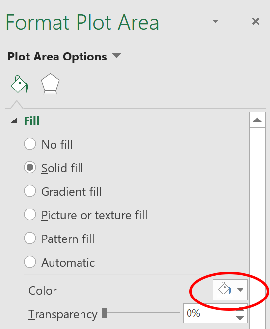
- The interior chart area has a white background. Right click on the interior chart area and choose Format Plot Area… to get the following dialog box:
- The duration bars are blue. Right click on the duration bars and choose Format Data Series… to get the following dialog box:

That’s it!
As you can see, with this procedure it is amazingly simple to:
- Add new tasks. Just insert a new row into the spreadsheet and the chart will update automatically.
- Change task dates. Just change the date in the spreadsheet and the chart will update automatically.
- Format the chart. The options are as limitless as Excel’s formatting options. Change fonts, sizes, bar colors, thicknesses, add gradients, borders, or backgrounds.
- Print the chart. It’s very easy to resize the chart for printing.
Pros
- Time. Even the web applications available today won’t get you a functioning gantt chart this quickly.
- Formatting options. The options for sizes and colors, font styles, gradient or pattern fills, and line thicknesses are superior to any other software out there.
Cons
- The x-axis. It is not very easy to see the chart in the context of months or weeks.
- Printing. You cannot print the chart over more than one page. Since most gantt charts have a long time duration (several months or more), the gantt chart becomes compressed horizontally when squeezed on to one page.